Deep Sky
-
Posts
3 -
Joined
-
Last visited
Content Type
Profiles
Forums
Events
Everything posted by Deep Sky
-
:) Just added a couple of pictures for demo purposes. The same pictures without the distracting copyright notice are here: http://forums.eagle.ru/showpost.php?p=1906829&postcount=14
-
The OFFICIAL Logo Design and Submission Thread
Deep Sky replied to luthier1's topic in Western Europe 1944-1945
New Logo Demos The original post of mine is already quite long. So I guess it is better to add a new reply. :) The Main Logo No.2, I forgot to mention yesterday, can also function well without its background in which it is presented, that is, with only the letters in the foreground, as shown below. These images are in the style of desktop wallpapers. Different colour themes of the logo are of course possible. (The first two images in the attachment box below are the same images with a copyright notice.) (Oh, I find again the source from which I once downloaded the photograph being used; it's here.
-
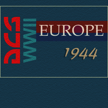
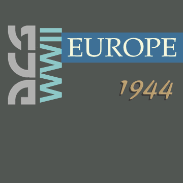
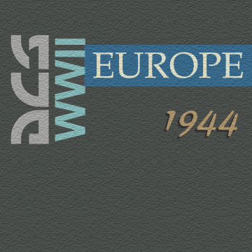
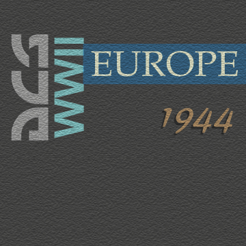
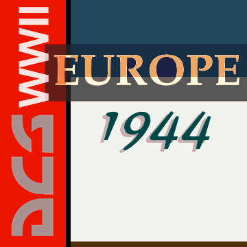
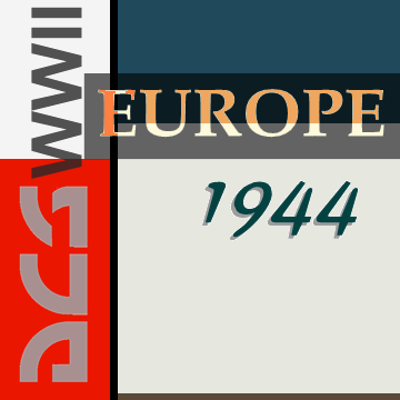
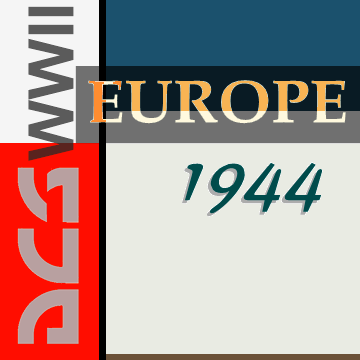
The OFFICIAL Logo Design and Submission Thread
Deep Sky replied to luthier1's topic in Western Europe 1944-1945
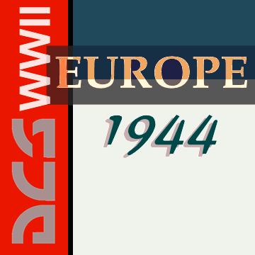
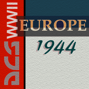
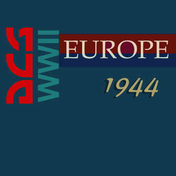
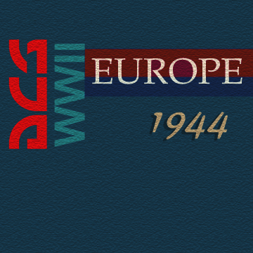
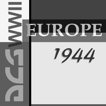
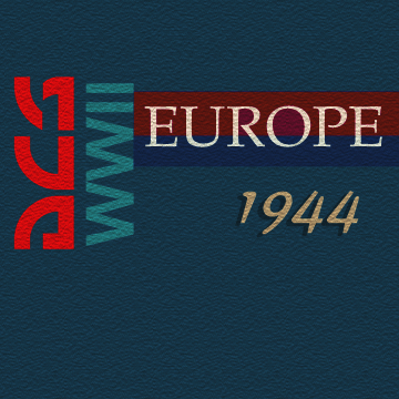
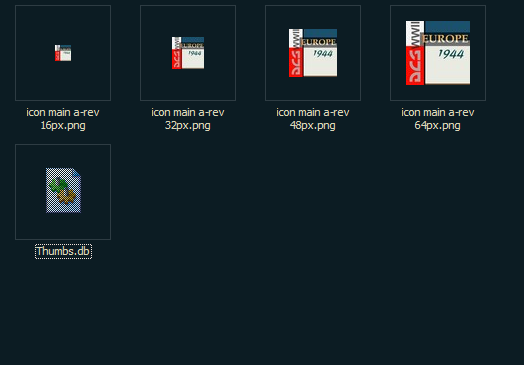
- Main Logo No.1 (Revised) (General purposes) (The small, bright, and somewhat irregular spots and lines in the font of EUROPE are part of the design. Yet it does not matter if they are lost in 'low resolution' embroidery.) - Main Logo No.2 (slightly revised) (Genral purposes.) - However, this general purpose logo No.2 should be cropped, or, on the contrary, its background extended, when used, although it is shown here as an exact square. The yellow rectangle in the following image is an example of the cropping. - - The Auxiliary Logo (Suitable for places where the main, visually stronger logos are not appropriate, such as the back covers of the game's aircraft manuals and strategy manual, and the background of certain web pages or pages in the manuals.) Black and white. By the way, it may be a good idea to manually change the browser's backgound colour so as to view the logo images against a darker background too. The original Main Logo No.1. Let me put it here anyway. Icons... 64px desktop 48px 32px 16px A dark background. The smaller of the icons can perhpas also be differently designed to suit their very small size. :)