netizensmith
-
Posts
123 -
Joined
-
Last visited
Content Type
Profiles
Forums
Events
Everything posted by netizensmith
-
Appreciate the response but seriously, come on mate: 1. I was quite specific that this issue is not just for exported displays 2. Where would someone put the code you specified anyway? If you're gonna tag this with {FIX} for those with exported displays at least tell them what file to put the code in.
-
Why have we got to do anything? It was fine before they made the changes!
-
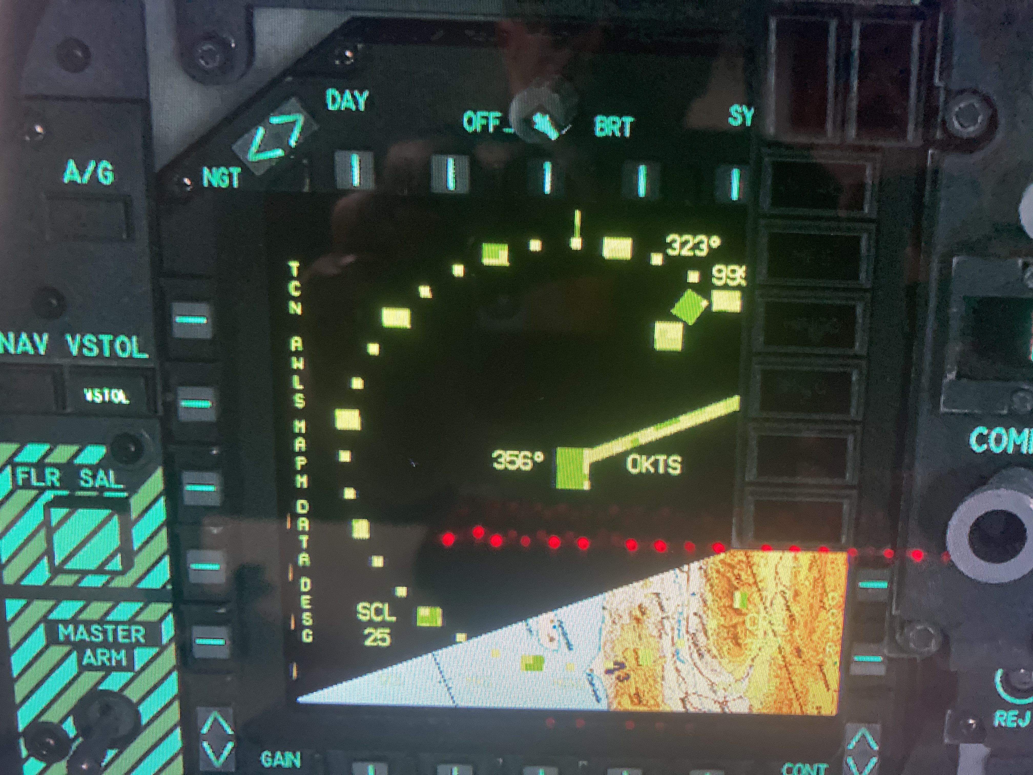
@RAZBAM_ELMONote this is a general issue, in 2D, VR and exported MFDs. The new black outline on the text, coupled with the reduced letter/symbology spacing makes it unreadable by default in 2D and VR. This seems to be the case for everyone; nobody has responded with "it looks fine" or "it looks better". It's worse across the board, for everyone. Best current workaround seems to be a 50 click reduction in gain and a 10 click reduction in contrast. This is good enough in 2D and VR to make the Harrier playable again. It's a particular shame because I always appreciated the superiority of the Harrier MFDs compared to the unusable Hornet's (I gather the Hornet is unusable - with a moving map background - in real life too so there's an argument to not change that one) but what little footage I've seen of the ream AV-8B shows that it does have a quite readable MFD with map background.
-
Can confirm. This fixes the problem (pancake and VR). In fact, the clarity might actually be the best it's been (Green, white and Yellow. Other colours are unreadable still)
-
Thankyou! It did seem rather convoluted. Problem with the Harrier is I'm never sure if it's me being an idiot or a bugged system.
-
Thanks for the comprehensive response! However, the DMT is not always locked. It has the concept of being locked, or not. If it is locked then sss depress x 2 makes the tpod slewable and when you slew it the dmt will not move and after slewing and hitting undesignate will return good to where dmt is locked. When dmt is not locked then sss depress x 2 gives you tpod slewable but doing so will move the dmt at the same time.
-
The display looks the same whether a target has been acquired or not. Am I missing some symbol that's letting me know? Is it a bug? Or os the real Harrier like this too? In case it's relevant I'm trying to use the TPOD to zoom in on a target, SSS depress twice to give control over to the DMT on my left display, slew onto a target, SSS depress twice again to get back to the TPOD, slew around looking for a better target and then if I find nothing then Undesignate to get the TPOD back to the DMT target. The issue is that the only indication that the DMT has locked on (that I can see) is a small jitter - blink and you miss it.
-
I have no issue with UFC digit inputs. Did it many times last night without issue, with the 65E. PT lock does soemtimes disengage; I'd assumed this was realistic but I don't know.
-
From the above we can see that more has changed than just a font outline. Waypoint 1 i marked at W1 now, rather than just 1 The fonts have less spacing between the letters. The fonts are larger. The default brightness looks overexposed / blown out. The text on top of the map is unreadable (on a monitor, we haven't even got to VR yet)
-
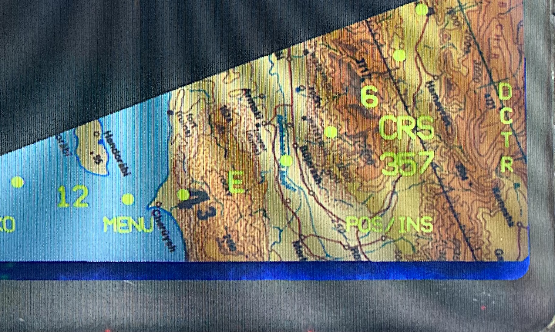
Cropped zooms: Top one is latest update from ED/Razbam. Bottom one is how it is in the current stable version i.e. prior to the update Full images, top one is Stable, bottom is latest beta

-
Tested in 2D at 4k and on a Reverb. It's so close it pains me to even mention this but my armaments were not showing on the stores page. Apart form that I'd say this is great work and is as it was before the last update. I confirmed that returning to the latest official files saw the armaments listed once more. Not yet. I raised it 21 hours ago so let's give them some time.
-
Looks like their code looks for files in multiple places (I could be wrong but how else would adding files that aren't supposed to be there change behaviour?). I've spent enough time on this. I can imagine there are some setups (particular resolutions) and times of day (mission time) and brightness settings, map backgrounds etc. whereby the outline around the symbology could be considered an improvement but there are clearly plenty of scenarios where it results in an unreadable cockpit.
-
Weird, I don't have it in root. Anyway, I have the previous version downloading in full now to another drive. I'll stick with my "fix" until Razbam sort it properly.
-
The zip file you attached has an MPCD_Materials.lua file in the root of indicator. The latest version has it in a Globals subfolder that did not previously exist but the contents are different. Interestingly, as the Harrier has the option for different colours overlayed onto the moving map, previously there were settings for these colours in MPCD_Materials.lua but now they are nowhere to be found anywhere in my entire DCS folder e.g. MPCD_VIOLET I cannot find anywhere
-
Yeah, I'm sure. Just did a repair and tried again. I'm happy with the settings change I mentioned in my post above for now; that would be least likely to interfere with any other changes they've made too. Changing the colours in the file you mentioned OR in the file I mentioned had no effect so no idea what's going on there lol.
-
Yep. Renamed the current folder, copied yours over and I get this (ignore red dots; that's my keyboard reflection!):
-
That causes a lot of the text to be replaced with artifacting in the form of squares. Does it work completely for you? The text that isn't corrupted for me does look better but it causes other problems.
-
I have posted this in then bug section of the forum now. If it affects you as well then please add to the]at post, giving details of your equipment to help the devs get a fix out. Razbam Elmo posted in Reddit that they had tested on 3 VR systems and he thought it looked fine so I don't know what's going on.
-
As title. Tried in 2D at 1440p and at 4K and in VR on an HP Reverb G1. Previously the MFDs were highly readable to me on both my 4K Flat display and in VR. Now all the symbology seems to have a black outline around it that renders it borderline unreadable in 2D and literally unreadable in VR. Discussion and evidence can be found in this thread:
-
It's not environments. It's this week's update vs the version prior. We can see that they are applying outlines in places they weren't before. I can't find a quick fix though. Hopefully they'll revert.
-
Thanks @imacken this shows that the colours have not in fact changed. There's more to it than that.
-
I'll try to fix the colours later. If anyone has a copy of the old MPCD_definitions.lua file that would help. The entire old " mods\aircraft\AV8BNA" folder hierarchy zipped up would be even better. EDIT: Ok, the colours are the same as before so it's something else... I don't know what. Could someone post the whole of the AV8NA folder?
-
Change mods\aircraft\AV8BNA\Cockpit\Displays\Display_StrokeDefs.lua to look like this: stroke_thickness = 0.5 stroke_fuzziness = 0.4 -- Currently is used for DMC generated fonts black outline --DMC_outline_thickness = stroke_thickness * 3 --DMC_outline_fuzziness = stroke_fuzziness * 1.1 DMC_outline_thickness = 0 DMC_outline_fuzziness = 0 DMC_stroke_thickness = 0.65 DMC_stroke_fuzziness = 0.42 Now all outlines are gone. That's not the end of the story though. They changed the default colour values to assume font outlines so these need to be made darker but I don't have time to do that right now. The colours are defined in MPCD_definitions.lua
-
I see complaints on here "How can Company X release the module with an error like this!?", well, they released a multi-million dollar actual aircraft with a moving map that can't actually be used so you can kinda see how that could happen.
-
I would say that the colour map display is, globally, worse in VR with yesterday's release than it was before. In 2D I think the colour map is more readable with the default green, or white text than it was before. All other colours are unreadable, particularly blue which was actually the best colour prior to this. Overall I'd much rather what we had before. Just tried the Hornet. Hard to tell with that because the colour map symbology was always unreadable, and continues to be, plus you can't change its colour.


.jpg.76cda9a9c68be6058db4bc9d16d2c247.jpg)
.jpg.a2e1c5ddf38234fe3af9fba9ce86ec26.jpg)