Search the Community
Showing results for tags 'ui'.
Found 15 results
-
Demo module KIOWA has wrong skin path and also wrong buy link. Here is the content of "Eagle Dynamics\DCS World\DemoMods\aircraft\OH-58D\entry.lua: local self_ID = "OH-58D Kiowa Warrior by Polychop-Simulations" declare_plugin(self_ID, { installed = true, dirName = current_mod_path, displayName = _("OH-58D(R)"), version = "16.12.24", --__DCS_VERSION__, registryPath = "Eagle Dynamics\\OH58D", state = "sale", info = _("OH-58D Kiowa Warrior by Polychop-Simulations"), linkBuy = { ED = "https://www.digitalcombatsimulator.com/en/shop/modules/gazelle/", }, Skins = { { name = "OH58D", dir = "Skins/1" }, }, }) plugin_done() Skins.dir must be "Skins" instead of "Skins/1". And linkBuy.ED must be "https://www.digitalcombatsimulator.com/en/shop/modules/kiowa/" instead of "https://www.digitalcombatsimulator.com/en/shop/modules/gazelle/".
-
 Issue: Chat closes when accessing the "Select Role" menu in multiplayer. Steps to Reproduce (STR): Enter or create a server. Close the initially open "select coalition" menu by joining spectators or pressing Esc Ensure that the chat is open pressing Tab button (by chat open I mean text in the chat is visible but input line not active) Press Esc to open the game menu Click on "Select Role." Result: The menu for coalition select appears and the chat closes. Expected Behavior: The menu for coalition select appears and the chat remains open Reproducibility: 100% Such behavior leads to a problem if you want to give importan information to players via chat on slot selection. For exmaple if the slot is locked or in some other cases too. A player should guess that he needs to reopen the chat to get the message and this may lead to confusion.
 -
So, as it's been batted around the forums since DCS was LOMAC, I've decided that the best course of action is to "Screw it", and design the UI element that I've been harping on about every time the topic comes up. This is just a concept image of the visual aid in action, and others can be made as well if people can supply me with some decent screenshots for drogue equipped planes, but I do have some ideas with some of my own screenshots. Anyway, to explain the concept, it goes like this: (Not Pictured, yet), when you first call to the Tanker your intent to refuel, a small, dot will appear on the tankers port side, indicating where you need to be to form up with the tanker. At the same time, the throttle bar (pictured) will appear, and give you an idea of the proper throttle settings your plane will need to be at to catch up to, and form up with the tanker. When it becomes your turn to get in position for pre-contact, the 'dot' moves to the pre-contact point, and all you need to do is get there, and call pre-contact. Post Pre-contact: Once you're ready, and the drogue is out, or boom is down, a diamond will appear. Where it appears depends on the type of plane you're in, if you're in a boom-refueling jet (like the F-16 pictured) it will appear at the form-up lights, if you're a probe and drogue refueling jet, it'll appear on the 'reel' of the Drogue system. A second diamond with cross hairs will be present inside the larger one. This smaller diamond represents your plane, and a perfect alignment and positioning should result in the diamonds becoming a single diamond. In the picture here, the plane is slightly offcenter and slightly back, but still connected (as indicated by the lit up CTCT under the throttle bar). The Throttle Bar: throughout the entire refueling process, from form up to peel off, a throttle bar will be on screen guiding you on the proper throttle settings for your aircraft to stay with the tanker. The yellow field will move up or down depending on the tankers speed in relation to your plane, and the red bar represents your throttle. The 'CTCT' at the bottom will inform you that you're connected to the tanker and taking fuel. The 'BRK' above the throttle bar is there to tell you if you need to use your air brake. In this image, it's greyed out, as the brakes aren't needed. However, they will change color depending on how much braking is needed. If it starts flashing, it is a warning to brake away from the tanker. This last bit made flash when you're fully fueled up as well, so don't worry. Some things to note though. First: This is just a concept made using a screen cap, and a few minutes of Paint Tool Sai. It is not programmed in any way, as that is not my cup of tea. Second, the idea behind this item is that it is a localized training aid. Meaning, that even if you're connected to a server and flying a multi-crew aircraft, if someone is using the system, and you aren't, you will not see it. Third: it is designed to be 100% optional. elements of it can be turned on or off as needed. Fourth: This is a feature designed to increase accessibility to DCS. Right now, DCS has a bit of a learning cliff in some areas, something that Nick himself has expressed as a potential issue. This is designed to mitigate some of the issues people have with this very difficult task. Finally: Hating on people who may have to rely on such a system should be strongly discouraged at every turn. Those people who come down on those for needing a little help, or who are just too busy with their real lives to learn the systems should not be given flak. We should be looking for solutions to support them, and make the transition from arcady sim to real sim as easy as possible. If they're scared off, they simply will not come back, and if they don't come back, they don't spend money on the game, and improve its development. Now, let's keep things civil. Tank out.
- 33 replies
-
- 5
-

-
- concept
- visual aid
- (and 3 more)
-
 Hello, i want to start a general discussion about a redesign of the Rearming menu. I don't think it's outdated, but ux definetly suffered with the addition of more weapons. I would like to encourage a discussion on how a weapons loadout menu could be designed more elegantly to reduce cluttered dropdown menus, maybe have more extentable menus like Bomb > Mk-82 - 500lb bomb > 3x on TER-9A Rockets > 2.75" Hydra > 19x M151 HE I'm happy with how it works on fighters with limited options like F-86 or MiG-21 but i find it exhausting to search through 30+ options of bombs on the F-18 only to take the wrong one. Especially because the Rack is named first. Easiest would be if they were sorted by guidance, then size and if the weapon name was before the rack name as in '3x Mk-82 - 500lb bomb on TER-9A' instead of 'TER-9A with 3x Mk-82 - 500lb bomb' Also i thought of the modern multirole tasking that oftenly required asymmetrical loadouts. Maybe the rearming menu could indicate how well the aircrafts is balanced in weight (and in drag?). Having a general idea of your balance could help to make the aircraft more stable through refining the position of the load or installing appropriate counterweights. This also kinda plays into the Hercules announcement and how we are going to balance different size and weight stores with our current system. It's just small implementations but with an impact on the greater picture of modernizing the core game.
 -
-
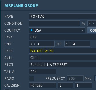
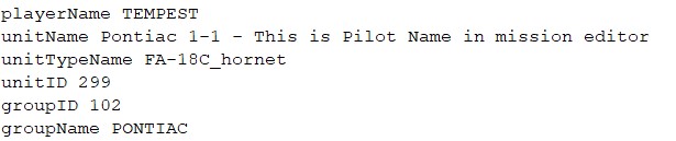
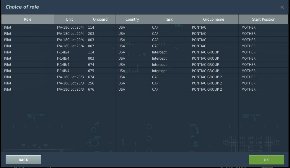
So there is some disconnect between what people see in the Mission Editor, what DCS thinks things are actually called and what people are presented with on the Select Role dialog. This is what a Mission Designer will see. If they want specific players in specific aircraft they might put the playerName in the PILOT field. This makes sense, but in DCS logic, that is actually the unitName. The 'player' has nothing to do at this point with anything on this unit or group. The playerName is actually set in the Multiplayer screen (top right I believe). This is what DCS Engine seems to think things are called: However, when it comes to the Select Role screen, the playerName is obviously not possible to show, but frustratingly the unitName is not either. Therefore it's very hard for the mission designer to tell players which unit they want them in, unless (as I do) I've given people the choice of their own tail number and they have to look for that. Perhaps an addition column with the 'unitName' would be very useful here. Esp if Mission Designers use it like ED have indicated and put the PILOT NAME inside the unitName field.

-
 -- #Region MonoSpaced -- local morseText = "\n" .. -- "A * - " .. " " .. "B - * * * " .. "C - * - *\n" .. -- "D - * * " .. " " .. "E * " .. "F * * - *\n" .. -- "G - - * " .. " " .. "H * * * * " .. "I * * \n" .. -- "J * - - - " .. " " .. "K - * - " .. "L * - * *\n" .. -- "M - - " .. " " .. "N - * " .. "O - - - \n" .. -- "P * - - * " .. " " .. "Q - - * - " .. "R * - * \n" .. -- "S * * * " .. " " .. "T - " .. "U * * - \n" .. -- "V * * * - " .. " " .. "W - * * " .. "X - * - -\n" .. -- "Y - * - - " .. " " .. "Z - - * * " .. "\n\n" .. -- "1 * - - - -" .. " " .. "2 * * - - -" .. "\n" .. -- "3 * * * - -" .. " " .. "4 * * * * -" .. "\n" .. -- "5 * * * * *" .. " " .. "6 - * * * *" .. "\n" .. -- "7 - - * * *" .. " " .. "8 - - - * *" .. "\n" .. -- "9 - - - - *" .. " " .. "0 - - - - -" -- #EndRegion MonoSpaced Above is a sample of text, perfectly aligned using a monospaced font. I had originally thought that DCS was not using a monospaced font as there are all sorts of font errors/bugs in DCS. However upon further investigation (see here:) It appears you ARE using a monospaced font. However, despite as you can see from the code sample that in a perfectly rendered monospace font, all the columns line up perfectly. In your game, it renders completely out of whack. From experience, I know that you often convert a font into a texture that you then 'slice' up into tiles so that you can render it in the graphical renderer fast and with low memory bandwidth. However I believe you have an error in this where you're trimming the space character differently to other characters. Possibly you're trimming others poorly too, but definitely the space character is broken. I've tested this with just lining up two rows of identically paired characters and changing one space before and after the left most character of the bottom row, they don't match. Something is wrong in your tiling/slicing or font renderer.
- 4 replies
-
- 1
-

-
- ui
- monospaced
- (and 2 more)
-
 Like in the resource manager of the mission editor, can you add a checkbox to hide non flyable/controllable aircrafts in the multiplayer select role screen like in the screenshot ? Some servers have hundreds of roles and its a pain in *** to scroll down each time, with the list full of modules you don't have multiplied by the number of available airbases/carriers/gunner positions/farps ... A search filter can also help, especially if its persistent.
-
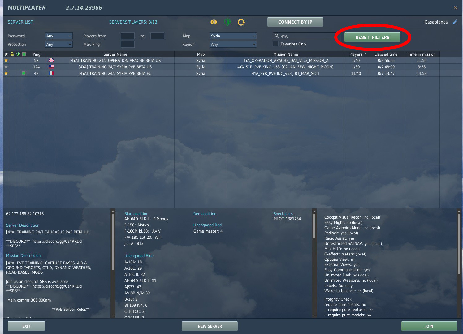
As the title says, can we have persistence of the servers list filters between sessions ? I used to use favs to quickly find servers, but the list got big with time, and finding this servers list have retained the previous filters criteria between sessions can be really useful. you can also add reset button to make the persistence obvious like the screenshot attached
-
The information we need is here, but it's modal and a pain to use, necessitating multiple clicks just to see the data. However, it would be cleaner an faster to make use of the space either on the right of the menu bar or in the bottom bar like this: You could even remove the modal dialog completely by doing this.
-
 1. Minimize Button The Launcher resides in the middle of the user desktop screen and does not behave like ordinary Windows apps ... or any common UI. It will not minimize by clicking on the app icon in the taskbar. There is no UI element to let the user minimize it. Why is that important? Nobody wants to look at this thing for 12 hours, while the game is downloading the new Afghanistan map. Yes, you can run other apps 'on top of it', in the middle of the screen and 'behaves' like it (rendering in full speed?!) and therefore is treated by the Windows OS and Kernel Scheduler in that way. See Windows documentation on 'best practices' for app developers on how to create an app that is compliant with UI/UX standards ... or see any modern HTML5 course? 2. Redundancy Issues Aside from that, there is the question of 'redundancy' once again withing DCS and the DCS UI. If something 'new' is not replacing something 'old' it can run in parallel, creating a duplicate process of the same task? Even interfering with it? You have now the Launcher, which allows for in-game setting changes, while you also have the in-game settings menu that does the same thing. That is 'fine', since both interfaces communicate with the same file and no user is going to simultaneously use both (launcher and in-game settings) to change values in both at the same time. 'Downloads' though, are a different thing ... A user can now start a download in the launcher. When s/he choses the download new DLC, s/he can still start the game and 'play' (because - as we all know - the actual download is a separate process and has it's own instance and GUI. But the user is still offered to download the same content s/he is already downloading, within the started game in the 'Module Manager'. Clicking that (and many users will do ... "just to be sure") is ... starting a new download process and overriding/deleting the previously started download in progress! ____ I see, someone is not familiar with the most basic rules of UI/UX development ... which are also basic programming rules, btw: "Don't repeat yourself", "Keep it simple", "One tool for one (type) of tasks", "close the door that you opened", etc, etc. At least 1. should be an easy fix?
 -
Since the past two or so months, the size of DCS World has ballooned to the point to which my SSD can just barely store it with 10% of its space left. I have nowhere else on my computer to install DCS, since my other SSD is a cheap, relatively slow one. I was hoping an option can be added to remove certain AI units and 3D models (perhaps from the new launcher) to try and reduce the size of DCS as much as possible. I really don't have the ability to buy a new SSD right now, and I am concerned that in a few more updates, DCS will no longer fit on my SSD, since it's already chock full.
-
Does anybody know how I can disable the Jester control wheel during replays? It keeps popping up while recording cinematics. Super excited about the F-4. I never thought of purchasing it until watching so many content creator videos. And man, she flies soooo well.
-
Hi, Since last update It would appear that i can no longer find the FPS display counter. I have the key binding ok and if do it twice it comes up with stats but not the fps display/graph. any ideas Eddy
-
DCS is currently missing support for OpenType font feature, making it impossible to write ligatures which is important in certain languages. Add Ligature feature to DCS please (☍﹏⁰。)